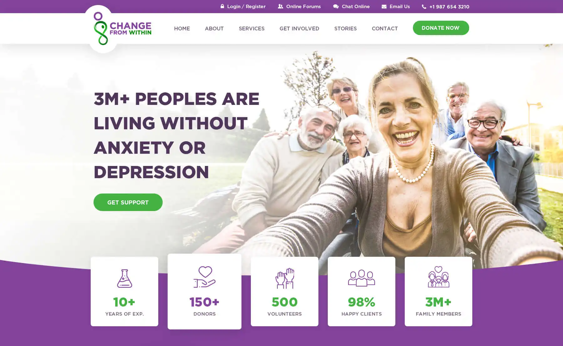
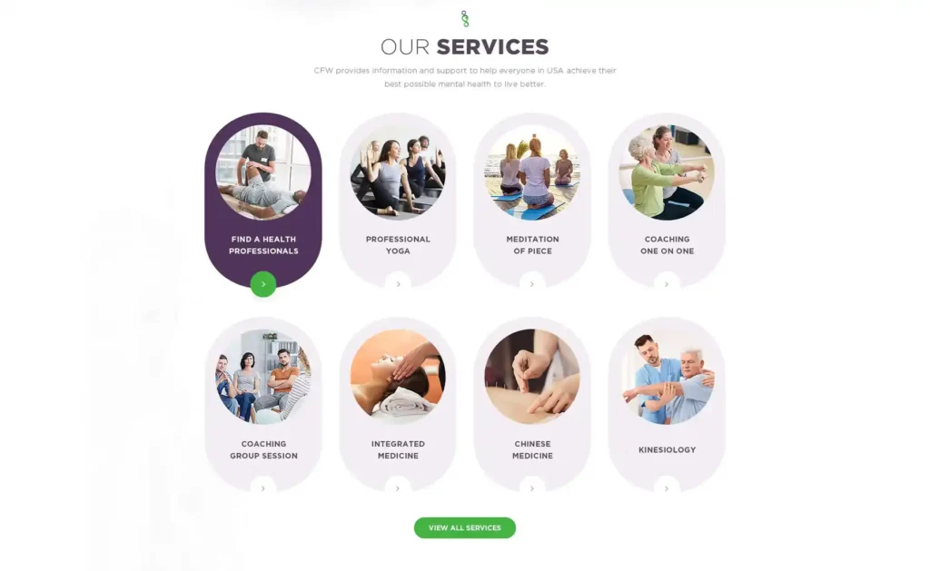
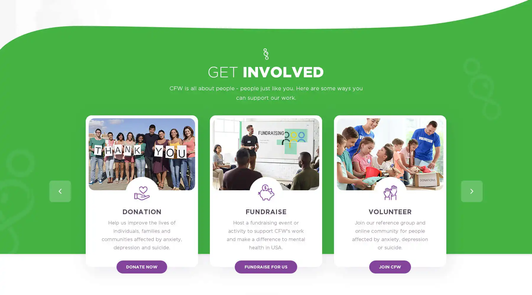
Developing a website idea through dynamic workshops.
Sector
Nonprofit, Culture, Mental Health, Youth Education
Challenge
The organization’s website needs to be redesigned to better connect with its audiences, including building a more intuitive information architecture and developing a coherent visual language.
My Role
Project Time
WORKSHOP # 1
Brand & Strategy Kickoff
Brand Attributes & Mission Statement
Culture How would our community describe us?
Target Groups How would we describe our target audience?
Voice How do we want to sound to others?
Feeling How do others feel after being in contact with us?
Impact What tangible impact do we have on others?
X-Factor How are we different from others?
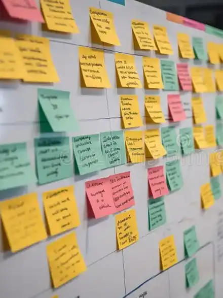
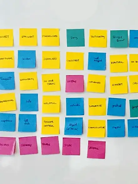
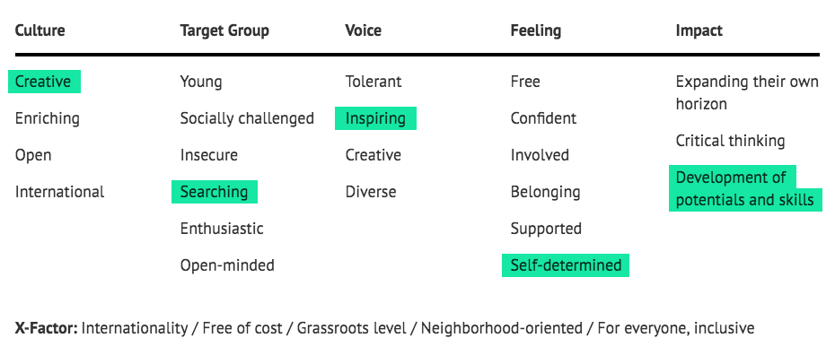
“ChangefromWithin provides cultural and political education to socially challenged adolescents. In a creative and inspiring environment they feel free and self-determined, developing their potential and abilities.”
Definition of Target Groups
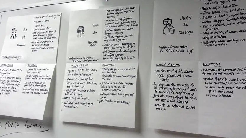
Setting Goals
Learning
In retrospect, I feel this exercise wasn‘t exactly what the client expected (probably an issue with my positioning) because I aimed towards thinking about the whole ecosystem instead of just the website itself (and probably failed on communicating it sufficiently in the beginning).
Usually, I do this exercise also in terms of revenue, but since the organization is well-funded, we‘ve left it out to save time. To expose potentially hidden treasures, I think it would have been good to do it anyway.
Also, I realized that the rating by numbers is kinda abstract. For the future I‘d prefer the effort impact mapping exercise, since it is way more tangible by evaluating the ideas by needed effort and expected impact, categorizing them into “Do now” (low effort, high impact), “Make it a project” (high effort, high impact), “Make it a task” (low effort, low impact) and “Skip” (high effort, low impact).
Finding a Visual Style
After the first workshop I took the mission statement and the brand attributes to craft a design directions aka stylescapes to present to the client right before starting the second workshop.
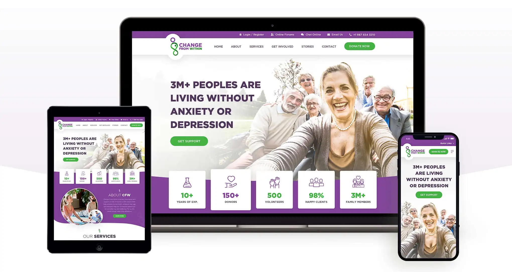

After the first workshop I took the mission statement and the brand attributes to craft a design directions aka stylescapes to present to the client right before starting the second workshop.
WORKSHOP #2
Information Architecture
Content Audit
To understand the old site and its content, I ran a content audit listing all available information and features. Based on this, we collectively decided what to keep, what to kick and how content can be integrated into a more intuitive information architecture.
Sitemap
Joint development of the sitemap, taking into account the defined proto-personas and the respective solutions to their problems and motivations as well as the objectives of the organization.
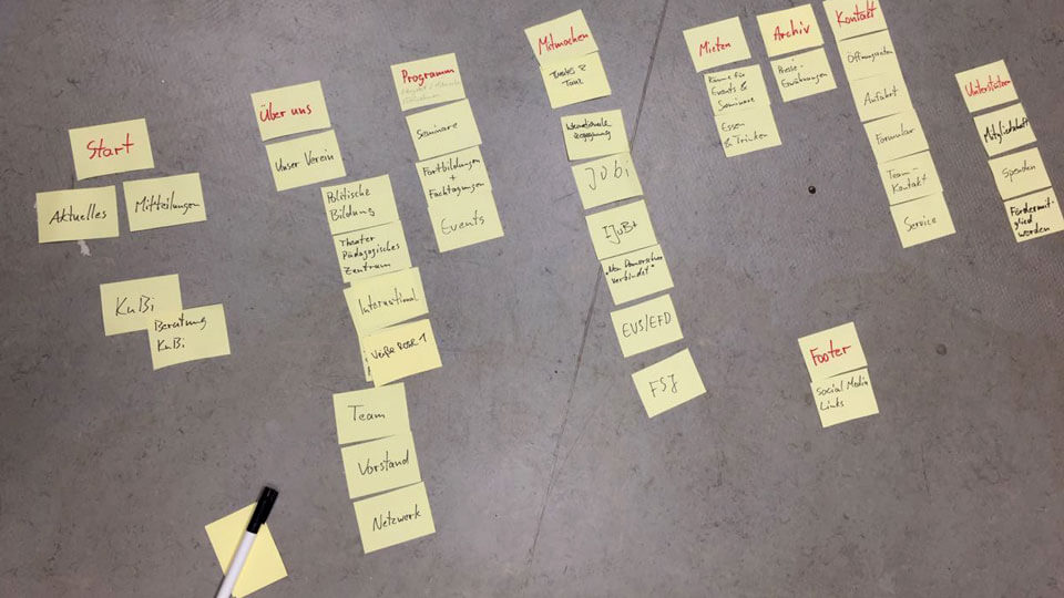
Learning
To make sure that the redesign isn‘t based too much on old content respectively to gain a fresh point of view, I will add one or two extra steps in the future (inspired by giveall):
- Rather than diving straight into the results of content auditing and building the new site based on the old content, it makes sense to challenge the group to list all of the content areas that they remember – without, of course, visiting the site. If anything is missing, this is a good sign to question whether these contents really need to stay in the new design.
- Create more stakeholders (proto-personas, 3-6) and think about what they need from the site before diving into the old content – and finally add what’s important to the organization, too.
Evaluation via Tree Tests
To ensure an intuitive understanding of the site‘s structure I tested the sitemap on-site with potential users through so-called tree-testing by giving them relevant tasks, such as “Where would you click if you wanted to join a theatre group?” Based on the test results, the sitemap has been adjusted accordingly.
Building the Site Structure
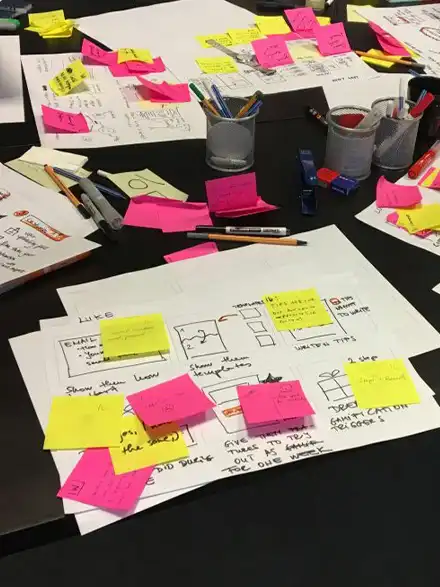
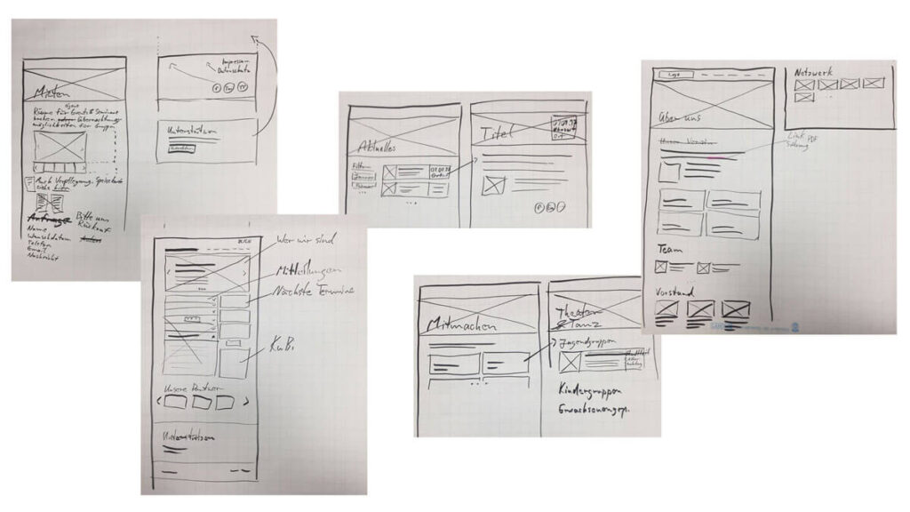
Jointly creating low-fidelity wireframes. The advantage was a direct buy-in of the approximate structure.
Learning
In retrospect, that was too much for the same workshop day, as the focus faded due to too many previous discussions. Nevertheless, the few we had completed were helpful as a starting point for the design phase, and after that, only very small concept changes were necessary.
In the future I will try a different approach – inspired by the UX workshop format from verynice – in which each person creates sketches of each main page, followed by a comparison of the various approaches and finally the creation of a best-of version. I prefer it because this way you go from quantity to quality.
Finding a Visual Style
After the first workshop I took the mission statement and the brand attributes to craft a design directions aka stylescapes to present to the client right before starting the second workshop.
Conclusion
As a learning: Make sure to really (I mean, really really) get the expectations of the group right and to clearly communicate the exact goal of the individual exercises – I thought I did so, but I felt a lack of understanding here and there.
Since I don‘t know all the technical details of building a WordPress site, some concepts were way more complex to implement, respectively way more complex to maintain by the client. Generally – and as I‘m able to do so – I would prefer to keep up the fast pace of the process by developing the website myself and being able to adjust little details without too much effort.
However, if there was more time, I would divide each of the workshops into two shorter days to keep up the focus. In addition, instead of two, I would build at least three personas, also run the prioritization exercise for revenue, and test the sitemap and site structure more thoroughly.
